How to Create a Reusable Modal Box in Laravel & VueJS

At some point or another, you'll need to display some modal box in your application. Either for a login form or to edit something or anything else.
So I thought it would be really nice if I can create a reusable component that lets us add as many modal boxes as we want.
But it wasn't as easy as I thought, though. There were some issues that I needed to solve in order to get a fully working reusable modal. And luckily I was able!
In this tutorial, I'd like to show you how you can build a reusable component for creating and displaying modal boxes with any content you want. Also, at the end of the tutorial I'm going to show you how to use any animation you want for the transitioning.
Preparing the environment
For this tutorial, we'll do all of our work in welcome.blade.php. So jump to it and replace everything with this.
<!DOCTYPE html>
<html>
    <head>
        <title>Modal Boxes</title>

        <link href="https://fonts.googleapis.com/css?family=Lato:100" rel="stylesheet" type="text/css">
        <link rel="stylesheet" href="/css/style.css">
    </head>
    <body id="app">
        <div class="container">
            <div class="content">
                <a href="#" @click="showModal" class="naked-link title">Show Modal</a>
            </div>
        </div>

        <script src="https://cdnjs.cloudflare.com/ajax/libs/vue/1.0.14/vue.min.js"></script>
        <script src="/js/main.js"></script>
    </body>
</html>
As you can see from above, we need to have style.css & main.js. So create them in the specified paths as shown.
This is what our CSS would be (in real life I would use a preprocessor like Stylus or SASS, but let's make things simple and use plain CSS).
html, body {
    height: 100%;
}

body {
    margin: 0;
    padding: 0;
    width: 100%;
    display: table;
    font-weight: 100;
    font-family: 'Lato';
}

.container {
    text-align: center;
    display: table-cell;
    vertical-align: middle;
}

.content {
    text-align: center;
    display: inline-block;
}

.title {
    font-size: 96px;
}

.Modal__container {
    max-width: 700px;
    width: 90%;
    background: white;
    border-radius: 2px;
    animation-duration: 0.3s;
    animation-delay: 0s;
}

.Modal__header {
    border-bottom: 1px solid white;
    padding: 15px 10px;
    background-color: silver;
    color: white;
    border-radius: 2px;
}

.Modal__header > h1 {
    font-size: 27px;
    font-weight: normal;
    margin: 0;
}

.Modal__content {
    padding: 10px;
}

.Modal__footer {
    padding: 5px;
}

.u-overlay {
    position: fixed;
    z-index: 1000;
    top: 0;
    left: 0;
    width: 100%;
    height: 100%;
    background-color: rgba(0,0,0,0.8);
    display: flex;
    align-items: center;
    justify-content: center;
}

.naked-link {
    color: inherit;
    text-decoration: inherit;
}
We're done with the CSS part. Now let's move on to main.js and instantiate our Vue instance.
new Vue({
    el: '#app',

    methods: {
        showModal: function() {
            alert("It's working!");
        }
    }
});
Nothing complex here. We're just alerting some message when the "Show Modal" link is clicked — just to make sure everything is connected correctly.
Creating a basic component to show & hide the modal box
Since Vue components were created for reusable elements, we'll start by creating one.
After we finish our component, we'll be able to create modals with this.
<modal-box title="The Title">
    <p>Here is the body.</p>
</modal-box>
But first we need to define a template for our component. So add this before the script tags.
<template id="modal-box-template">
    <div @click="closeModal" v-show="isModalOpen" class="Modal u-overlay">
        <div @click.stop="" v-show="isModalOpen" class="Modal__container">
            <header class="Modal__header">
                <h1>
                    @{{ title }}
                </h1>
            </header>

            <div class="Modal__content">
                <slot></slot>
            </div>

            <footer class="Modal__footer"></footer>
        </div>
    </div>
</template>
This template has five main sections.
- The header: Contains the title of the modal.
- The content: Contains everything we write between <modal-box></modal-box>. That's the job of <slot></slot>
- The footer: In this case it's just for some padding at the bottom of the modal.
- The container: The outer container for the modal box (which contains: header, content and footer).
- The overlay: It's for showing the dark overlay layer behind the modal.
When the user clicks on the overlay, the modal should close. But what about when the outer container is clicked? Since it's contained by the overlay we should stop the propagation of the click event. And that's by adding this portion @click.stop="".
Also note how we show the modal only when the modalIsOpen boolean is true. We'll talk about it later.
Now let's define our actual component. As a start, we'll implement it as the following.
Vue.component('modal-box', {
    template: '#modal-box-template',

    props: ['title'],

    computed: {
        isModalOpen: function() {
            return this.$root.modalIsOpen;
        }
    },

    methods: {
        closeModal: function() {
            this.$root.modalIsOpen = false;
        }
    }
});
Like any basic component, we specify the template it'll use and the property it'll accept (in this case title). However, you may wonder why we use this.$root.modalIsOpen instead of just this.modalIsOpen. It's because we're referencing a property on the main Vue instance. This property is what we'll use to decide whether to show or hide the modal box.
So this means we need to add it to our Vue instance.
new Vue({
    el: '#app',

    data: {
        modalIsOpen: false
    },

    methods: {
        showModal: function() {
            this.modalIsOpen = true;
        }
    }
});
Finally, add the modal box anywhere you want and check your work in the browser.
<modal-box title="The Title">
    <p>Here is the body.</p>
</modal-box>
The problem of having multiple modal boxes
When you have one modal everything will work perfectly fine. However, when you try to add more than one, you'll notice that all defined modals will open instead the one you want.
For example, add two links instead of one.
<body id="app">
<div class="container">
<div class="content">
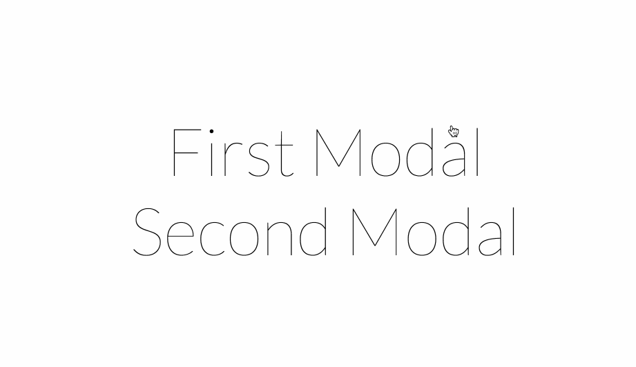
<a href="#" @click="showModal" class="naked-link title">First Modal</a><br>
<a href="#" @click="showModal" class="naked-link title">Second Modal</a>
</div>
</div>
...
And two modal boxes.
<modal-box title="First Modal">
    <p>Here is the body.</p>
</modal-box>

<modal-box title="Second Modal">
    <p>The body of the second modal.</p>
</modal-box>
Now open up the browser and click on any link. You'll notice that both modal boxes will show up.
So how to solve this problem?
The way we'll solve it is by attaching an id to each model we define. And we'll tell the link (or whatever the user will click) which model box to open.
So first add an id for both modals.
<modal-box id="firstModal" title="First Modal">
    <p>Here is the body.</p>
</modal-box>

<modal-box id="secondModal" title="Second Modal">
    <p>The body of the second modal.</p>
</modal-box>
This means we need to define a property for that in the component.
Vue.component('modal-box', {
    template: '#modal-box-template',

    props: ['id', 'title'],

    ...
Then you need to update the links accordingly.
<a href="#" @click="showModal('firstModal')" class="naked-link title">First Modal</a><br>
<a href="#" @click="showModal('secondModal')" class="naked-link title">Second Modal</a>
Now to the tricky part. Before, we were using the modalIsOpen property to check whether the modal is open or not. We still need a property like this one but this time for every modal box we define.
How can we accomplish such a thing? Of course we don't want to define them manually each time we have a new modal box.
As always Vue has an easy solution for us. We can use the $set method to set new properties.
The great thing about $set is that it sets values on the Vue instance even if they don't exist. And that's what we want.
Let's start with the Vue instance itself. First, delete the modalIsOpen property because we no longer need it. Then change the showModal method accordingly.
showModal: function(id) {
    this.$set(id + 'IsOpen', true);
}
Lastly, update the isModalOpen computed property and closeModal method like this.
Vue.component('modal-box', {
    template: '#modal-box-template',

    props: ['id', 'title'],

    created: function() {
        this.closeModal();
    },

    computed: {
        isModalOpen: function() {
            return this.$root[this.id + 'IsOpen'];
        }
    },

    methods: {
        closeModal: function() {
            this.$root.$set(this.id + 'IsOpen', false);
        }
    }
});
You can see that we also added created function above the computed properties section. This function is executed just after the instance is created. It's job here is to set the default value of the modal-open-state to false (which is the same as calling closeModal). Without it nothing will work.
Now you are able to have multiple modal boxes. Great!
Passing data to the modals
Although we can use any data in our modal boxes directly from our blade code, there's still a problem you may not be aware of. And that's when you use it inside a @foreach loop.
In order to access the variables directly, you have to define the <modal-box> element in the scope where they are available. And that's a problem when you have a loop. It's because you'll end up with the modal being defined each time the loop runs.
@foreach ($tags as $tag)
  <modal-box id="tagModal" title="Edit tag">
      <form action="/tag/{{$tag->id}}">
        ...
      </form>
  </modal-box>

  <a href="#" @click="showModal('tagModal')">{{ $tag->name }}</a>
@endForeach
To solve this problem we need to be able to pass the data to that modal instead of getting them directly from the blade file.
To do that we need to have a modalData property in our Vue instance.
data: {
    // modalIsOpen was removed
    modalData: {}
},
This property will have the data sent from the link we click. For example, your link will look something like this.
<a href="#" @click="showModal('firstModal', {{ json_encode(['foo' => 'FOO VALUE', 'bar' => 'BAR VALUE']) }})" class="naked-link title">First Modal</a><br>
Before we send the data it needs to be encoded to JSON, so we used json_encode.
Next, we need to update the showModal method in the Vue instance.
showModal: function(id, data) {
    this.$set(id + 'IsOpen', true);
    this.modalData = data;
}
That's it! Now you can use pass data to your modals. And you would use them like this.
<modal-box id="firstModal" title="First Modal">
    <p>Here is the body. @{{ modalData.foo }} and @{{ modalData.bar}}</p>
</modal-box>
Now with that, it doesn't matter where you define the modal box. Everything will just work as intended.
A quick tip before we end up this section. If you're anything like me, you might find it a little bit messy to write "json_encode" every time you need to pass data to your modal.
To make it clearer, you can extract a helper function like this one.
function showModal($id, array $data = [])
{
    $toJSON = json_encode($data);
    return "showModal('$id', $toJSON)";
}
This allows you to write this.
<a href="#" @click="{{ showModal('firstModal', ['foo' => 'FOO VALUE', 'bar' => 'BAR VALUE']) }}" class="naked-link title">First Modal</a><br>
It also doesn't require you to provide an empty array if you don't have any data to pass.
Adding animation for transition
The modal box component is working, but it feels a little bit boring, doesn't it? Let's make it more attractive by adding some transition while it's showing and leaving.
VueJS makes it so easy to add such a feature. Thanks VueJS!
I like to use the library for things like this. And luckily VueJS supports it.
Here's how to do it.
First, include the CDN version in the <header>.
<link rel="stylesheet" href="https://cdnjs.cloudflare.com/ajax/libs/animate.css/3.5.1/animate.min.css">
Next, we need to tell the modal's outer container and the overlay about the animation they need to run.
<div @click="closeModal" v-show="isModalOpen" transition="fade" class="Modal u-overlay animated">
    <div @click.stop="" v-show="isModalOpen" transition="fadeWithMove" class="Modal__container animated">
    ...
All we've is done is adding the animated class and the transition attribute to each one.
The animated class is required by Animate.css so it knows which elements will be animated.
The transition attribute is to tell Vue the name of the animation it will run.
This means we need to define these animations, like this.
Vue.transition('fade', {
    enterClass: 'fadeIn',
    leaveClass: 'fadeOut'
});

Vue.transition('fadeWithMove', {
    enterClass: 'fadeInDown',
    leaveClass: 'fadeOutUp'
});
fade and fadeWithMove are the names of the animations (you can name them whatever you want). But what you put in the enterClass or leaveClass are the kind of animations you want to execute when the modal is either opening or closing. You can get these names from the .
So, all of this means we've added a normal fade animation for the overlay element. And a fade with movement for the outer modal container. Both will run simultaneously.
Finally, you can control the speed of your animations with this CSS code.
/** Control the animation speed **/
.animated {
    animation-duration: 0.4s;
    -webkit-animation-duration: 0.4s;
    -moz-animation-duration: 0.4s;
}
We're done
Great! Now we're done. Maybe this one required a lot of work, but the result is worth it.
Another great thing is that this one works perfectly with Ajax validation, which I showed you in the previous tutorial.
You can view the full source code in this .
About Taha Shashtari
I'm a freelance web developer. Laravel & VueJS are my main tools these days and I love building stuff using them. I write constantly on this blog to share my knowledge and thoughts on things related to web development... Let's be friends on twitter.