Building an Awesome Reusable Autocomplete-Input Component in Vue 2.1 (Part One)
Vue has always made it easy for us to build reusable components, and it even made it easier with its v2.1 release. I'd felt so excited when I read Scoped Slots in the release notes, even before I saw the details.
For me, this feature was the missing piece of Vue, because without it, I ended up doing a lot of workarounds to get my reusable components to work.
In this tutorial, I'd like to show you how this great feature works while we're building a really cool reusable autocomplete component.
You can see what we're going to build in this jsfiddle.
Preparing the project
To make things simpler, we're going to do all of our work, except for styling, in a single html file named index.html.
Let's begin by importing the necessary resources at the top of our index.html.
<title>Vue Awesome Autocomplete</title>
<link rel="stylesheet" href="https://unpkg.com/bulma/css/bulma.css">
<link rel="stylesheet" href="https://maxcdn.bootstrapcdn.com/font-awesome/4.7.0/css/font-awesome.min.css">
<link rel="stylesheet" href="style.css">
<script src="https://unpkg.com/vue/dist/vue.js"></script>
All the resources above, except style.css, are CDN versions. This means we, obviously, need to create that style.css and put the needed styles in it. And since this tutorial isn't about CSS, I can skip explaining what's in it and just show you the code:
html, body {
  height: 100%;
}
#app {
  font-family: 'Avenir', Helvetica, Arial, sans-serif;
  -webkit-font-smoothing: antialiased;
  -moz-osx-font-smoothing: grayscale;
  text-align: center;
  color: #2c3e50;
  display: flex;
  justify-content: center;
  padding-top: 100px;
  height: 100%;
}

ul {
  list-style-type: none;
  padding: 0;
}

li {
  display: inline-block;
  margin: 0 10px;
}

input {
  font-family: 'Avenir', Helvetica, Arial, sans-serif;
}

.autocomplete-input {
  position: relative;
  height: 300px;
}

ul.options-list {
  display: flex;
  flex-direction: column;
  margin-top: -12px;
  border: 1px solid #dbdbdb;
  border-radius: 0 0 3px 3px;
  position: absolute;
  width: 100%;
  overflow: hidden;
}

ul.options-list li {
  width: 100%;
  flex-wrap: wrap;
  background: white;
  margin: 0;
  border-bottom: 1px solid #eee;
  color: #363636;
  padding: 7px;
  cursor: pointer;
}

ul.options-list li.highlighted {
  background: #f8f8f8
}
Next, get back to index.html and add the following code bellow the importing section:
<div id="app">
</div>

<script>
  new Vue({
    el: '#app',
    data: {
      options: [
        {
          title: 'First Scene',
          description: 'lorem ipsum dolor amet.',
          thumbnail: 'http://lorempicsum.com/nemo/200/200/1'
        },
        {
          title: 'Second Scene',
          description: 'lorem ipsum dolor amet.',
          thumbnail: 'http://lorempicsum.com/nemo/200/200/2'
        },
        {
          title: 'Third Scene',
          description: 'lorem ipsum dolor amet.',
          thumbnail: 'http://lorempicsum.com/nemo/200/200/3'
        },
        {
          title: 'Fourth Scene',
          description: 'lorem ipsum dolor amet.',
          thumbnail: 'http://lorempicsum.com/nemo/200/200/4'
        }
      ]
    }
  })
</script>
This looks, so far, like any typical small Vue project. And, for simplicity's sake, I hardcoded the options that we'll use in our reusable autocomplete component.
Now let's create the basic structure, which we'll incrementally build, of that autocomplete component.
First, define the component above your main Vue instance:
<script>
  Vue.component('autocomplete-input', {
    template: '#autocomplete-input-template'
  })

  new Vue({
    el: '#app',
    //...
Second, define that template bellow <div id="app">:
<script id="autocomplete-input-template" type="text/x-template">
  <h1>Hello from AutocompleteInput!</h1>
</script>
Finally, use that component inside <div id="app">:
<div id="app">
  <autocomplete-input></autocomplete-input>
</div>
After following all previous steps, your html file should look like this:
<title>Vue Awesome Autocomplete</title>
<link rel="stylesheet" href="https://unpkg.com/bulma/css/bulma.css">
<link rel="stylesheet" href="https://maxcdn.bootstrapcdn.com/font-awesome/4.7.0/css/font-awesome.min.css">
<link rel="stylesheet" href="style.css">
<script src="https://unpkg.com/vue/dist/vue.js"></script>

<div id="app">
  <autocomplete-input></autocomplete-input>
</div>

<script id="autocomplete-input-template" type="text/x-template">
  <h1>Hello from AutocompleteInput!</h1>
</script>

<script>
  Vue.component('autocomplete-input', {
    template: '#autocomplete-input-template'
  })

  new Vue({
    el: '#app',
    data: {
      options: [
        {
          title: 'First Scene',
          description: 'lorem ipsum dolor amet.',
          thumbnail: 'http://lorempicsum.com/nemo/200/200/1'
        },
        {
          title: 'Second Scene',
          description: 'lorem ipsum dolor amet.',
          thumbnail: 'http://lorempicsum.com/nemo/200/200/2'
        },
        {
          title: 'Third Scene',
          description: 'lorem ipsum dolor amet.',
          thumbnail: 'http://lorempicsum.com/nemo/200/200/3'
        },
        {
          title: 'Fourth Scene',
          description: 'lorem ipsum dolor amet.',
          thumbnail: 'http://lorempicsum.com/nemo/200/200/4'
        }
      ]
    }
  })
</script>
Creating the basic element
In this section, we'll create the basic html structure for our component and display each option's title.
Put the following html code inside the component's template after removing <h1>Hello from AutocompleteInput!</h1>:
<script id="autocomplete-input-template" type="text/x-template">
  <div class="autocomplete-input">
    <p class="control has-icon has-icon-right">
      <input
        class="input is-large"
        placeholder="Search..."
      >
      <i class="fa fa-angle-down"></i>
    </p>
    <ul class="options-list">
      <li v-for="option in options">
        {{ option.title }}
      </li>
    </ul>
  </div>
</script>
Let's now define options in the component's props list and pass it from the parent.
Vue.component('autocomplete-input', {
  template: '#autocomplete-input-template',
  props: {
    options: {
      type: Array,
      required: true
    }
  }
})
<autocomplete-input
  :options="options"
></autocomplete-input>
With that being done, you should see this in the browser:

Using scoped slots to customize option items
We, finally, arrived to the main topic of this tutorial. We'll see how to use the new scoped slots feature to let users of the component customize the appearance of the displayed options.
If you have ever worked with slots before, check the docs if not, you know that you can embed vue-compiled html code into the component's template code from its parent component.
That's a really great way to build reusable component; however, before v2.1 came out, we didn't always find it helpful because it was restricting its scope only to the parent scope. This means, we had no way to use data from the child scope in the slots we're filling.
If it's still not clear yet, take a look at our example, for instance. Our goal is to let users customize the options displayed in that component. But how is that supposed to work if we can't access each option's data – like title, description, and thumbnail – as AutocompleteInput component is looping over them? The answer is using scoped slots.
To make things easier to understand, let's start using that scoped slot before we even create it in the component. The way we use scoped slots is by opening a <template> tag inside the body of our <autocomplete-input> component, like so:
<autocomplete-input
  :options="options"
>
  <template slot="item" scope="option">
  </template>
</autocomplete-input>
Note that, like named slots, we identify the slot by its name using slot attribute. But the new thing here is the scope attribute. This attribute is what makes Vue aware that we want to access the child scope with the name option. Note that you can name the scope whatever you want, I chose option because it makes more sense in our case.
After that, you can start using whatever data the component exposes through that option variable. In our case, we know that the component should give us access to option's title, description, and thumbnail. So, let's continue with that in mind.
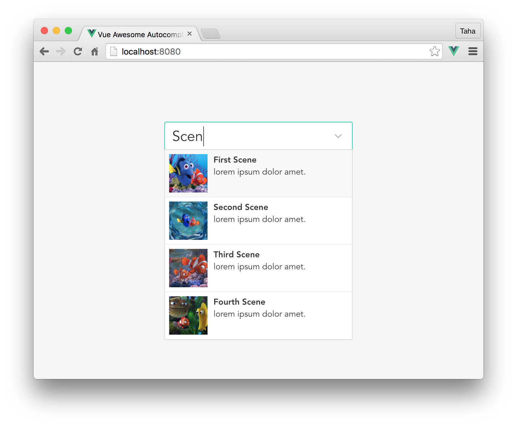
You can design the option however you like. For me, I, with the help of bulma, will use this markup:
<autocomplete-input
  :options="options"
>
  <template slot="item" scope="option">
    <article class="media">
      <figure class="media-left">
        <p class="image is-64x64">
          <img :src="option.thumbnail">
        </p>
      </figure>
      <p>
        <strong>{{ option.title }}</strong>
        <br>
        {{ option.description }}
      </p>
    </article>
  </template>
</autocomplete-input>
This sure won't work since we haven't declared that slot in our component yet. To do so, go to the component's template and replace {{option.title}} with this:
<slot name="item"
  :title="option.title"
  :description="option.description"
  :thumbnail="option.thumbnail"
>
As you can see, the <slot> has the name item, which we used to identify it in <template>. Also, note how we pass the data the same way we pass props to components.
After this, your component's template will become like this:
<script id="autocomplete-input-template" type="text/x-template">
  <div class="autocomplete-input">
    <p class="control has-icon has-icon-right">
      <input
        class="input is-large"
        placeholder="Search..."
      >
      <i class="fa fa-angle-down"></i>
    </p>
    <ul class="options-list">
      <li v-for="option in options">
        <slot name="item"
          :title="option.title"
          :description="option.description"
          :thumbnail="option.thumbnail"
        >
      </li>
    </ul>
  </div>
</script>
Here's what you should see now in the browser:

The rest
We've just finished implementing the heart of our component. If your goal was just to learn about scoped slots, you're done. However, if you're also interested in seeing how the rest of the component is built, move on to the second part.
About Taha Shashtari
I'm a freelance web developer. Laravel & VueJS are my main tools these days and I love building stuff using them. I write constantly on this blog to share my knowledge and thoughts on things related to web development... Let's be friends on twitter.